
Why Brand Guidelines Matter
Here is a scenario we see constantly. A company has a good logo and a decent look. Then the team grows. A freelancer designs a menu. A media buyer builds ads. A new hire makes social posts. Six months later the brand looks like six different companies wearing the same logo.
Nobody did anything wrong. They just had nothing to follow.
What guidelines actually do
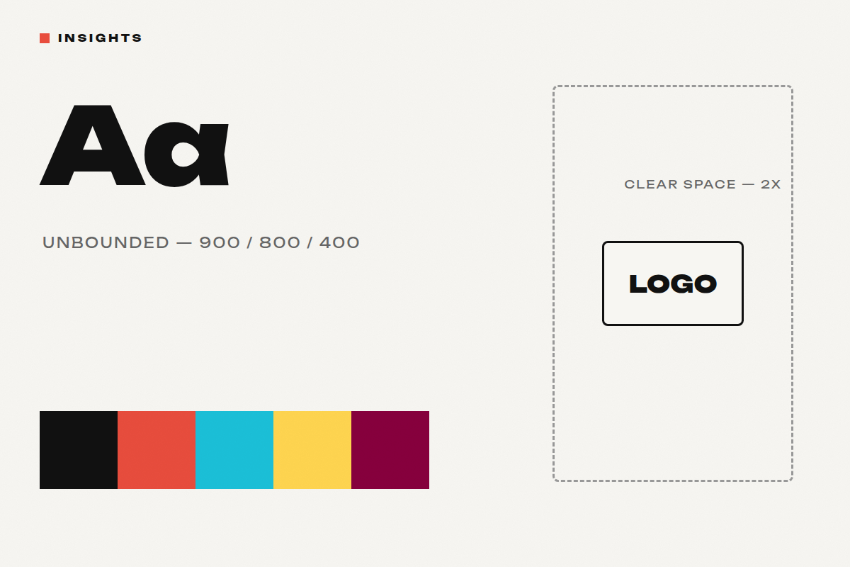
Brand guidelines turn taste into rules that travel. They define the logo and its clear space, the exact colours and when to use them, the typography hierarchy, the photography and image direction, the graphic elements, and the voice — with real examples of right and wrong. Good guidelines are less about restriction and more about speed: every designer, agency or intern starts from the answer instead of guessing.
A brand guideline is the difference between a brand and a logo with luck.
The compounding effect
Consistency is not an aesthetic preference — it is how recognition gets built. Every touchpoint that follows the system deposits into the same account. Every touchpoint that improvises makes a small withdrawal. Over a year, the difference between brands people recognise instantly and brands people scroll past is usually not budget. It is discipline — written down.
When you know it’s time
You need guidelines when more than one person creates for the brand, when you work with any external partner, when your feed looks different month to month, or when you catch yourself saying “that doesn’t feel like us” without being able to explain why. That feeling is the absence of a written system.
What this means for brands
Guidelines are not a document you commission for the shelf. They are operational infrastructure — as practical as your CRM. If your brand is growing, they are the cheapest insurance you will ever buy against slowly becoming generic.
We build brand guidelines as part of Branding at Ideative.

A Logo Is Not a Brand
When a company tells us “we need branding,” the next sentence is usually about a logo. It makes sense — the logo is the part of a brand you can point at. But it is a signature, not the person signing.
What a brand actually is
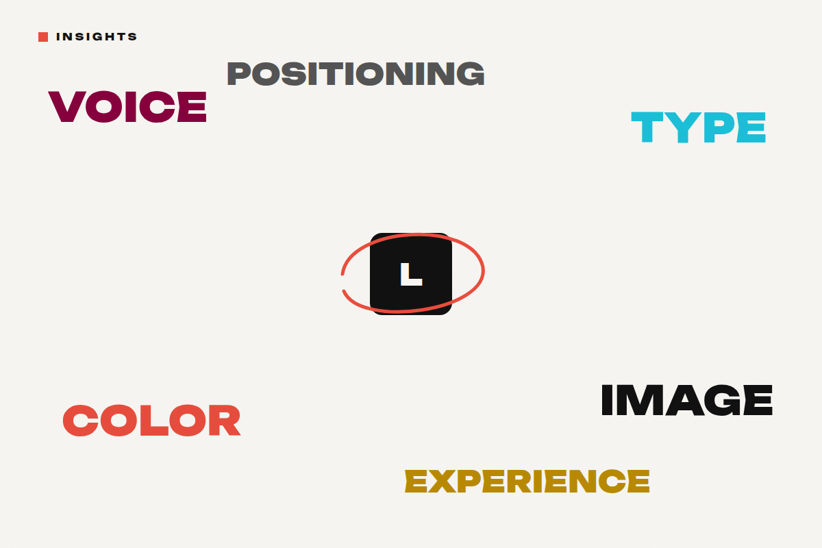
A brand is the sum of decisions that shape how people perceive a business. Positioning: what you stand for and against. Visual language: typography, colour, photography style, graphic elements — the system the logo lives inside. Tone of voice: how the brand sounds in a caption, a complaint reply, a job ad. And experience: what it feels like to walk in, order, unbox, or scroll your feed. The logo appears in all of it. It carries almost none of it alone.
People don’t fall in love with a mark. They fall in love with what it consistently stands for.
The test
Cover the logo on your latest campaign, your packaging, your feed. Would people still know it’s you? Strong brands pass this test easily — the typography, colour, photography and voice carry the identity. If everything collapses without the logo, you don’t have a brand system. You have a mark and a collection of unrelated decisions.
Why this matters commercially
A logo redesign changes one asset. A brand system changes how every future asset gets made — every post, menu, package and campaign starts from a defined position instead of a blank page. That is why brand identity work pays for itself: it makes every subsequent piece of marketing cheaper to produce and stronger when it lands. It is also why some brands look expensive before you ever see a price — restraint, consistency and art direction communicate value without saying a word.
What this means for brands
If your identity feels inconsistent, don’t start by redrawing the logo. Start by asking what the brand stands for, how it should sound, and what visual system can carry that everywhere. Sometimes the logo barely changes — and everything around it transforms.
Brand identity, guidelines and packaging are part of Branding at Ideative.